Brand Guidelines
ButterflyMX brand identity

Who we are
Founded in 2014, ButterflyMX is on a mission to empower people to open and manage doors & gates from a smartphone. Our products are installed in more than 10,000+ multifamily, commercial, gated communities, and student-housing properties worldwide, including properties developed, owned, and managed by the most trusted names in real estate.
Our features are designed for developers, owners, property managers, and tenants. And our products lower operating costs and improve tenant satisfaction. Developers and owners no longer need to run building wiring or install in-unit hardware. Property managers can grant building access, revoke permissions, and review entry logs from an online dashboard. Residents can open doors from their smartphones, issue visitor access, and see who is trying to enter the building.
Our brand
Every brand interaction should feel welcoming, simple, and friendly. Use the following list to guide all design and communications.
- Open
- Friendly
- Simple
- Convenient
- Welcoming
- Accessible
- Inclusive
- Delightful
- Aspirational
- Modern
- Secure
Tone + voice
The ButterflyMX brand is fun, cheerful, and welcoming. We spread positivity and position ourselves as a helpful solution to improve the lives of our clients. In written content, ButterflyMX messaging is uplifting — we talk about how our products welcome people in while unlocking positive experiences for building staff, residents, and visitors.
Example
ButterflyMX is your complete property access solution, providing a secure, convenient, and affordable way to manage and grant access on the go. Empower your tenants and building staff to open doors, gates, and elevators with a smartphone and ensure they never miss a visitor or delivery. Enjoy easy installation and cut costs by eliminating building wiring and in-unit hardware, and save time by integrating with popular access control and property management systems. Join the 10,000+ multifamily, commercial, gated community, and student housing properties that have made access simple with ButterflyMX.
Products
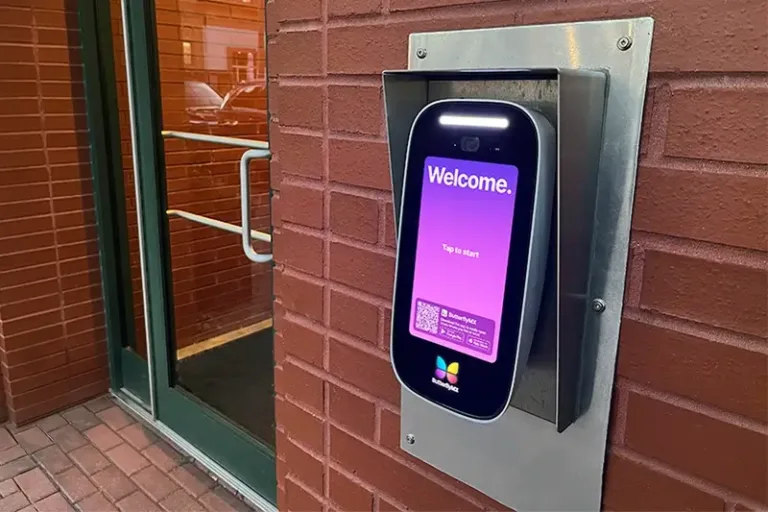
Video intercom
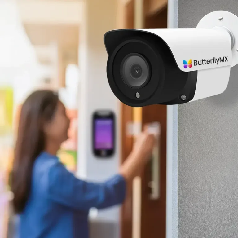
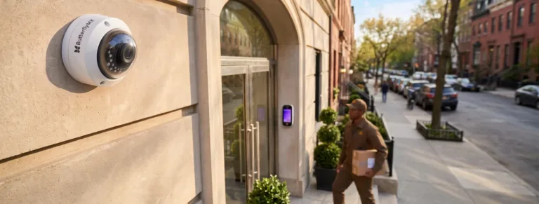
To easily manage door, gate, and garage access from a smartphone or computer, see who you are letting in, and connect to your property management & access control system.
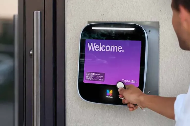
Access control
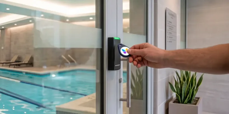
For property-wide access to any door, gate, or elevator into and throughout your entire building through the ButterflyMX mobile app, PIN codes, key fobs, and key cards.
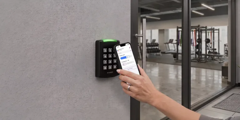
Keypad
For smart, simple, and secure access to amenity spaces, auxiliary doors, garages, and more.
ButterflyMX OS
An online platform for building staff to seamlessly manage property access and integrate our products with other property management tools and services.
Self-guided tours
For prospective residents to tour your property on their schedule while keeping your property safe and secure.
Vehicle access control
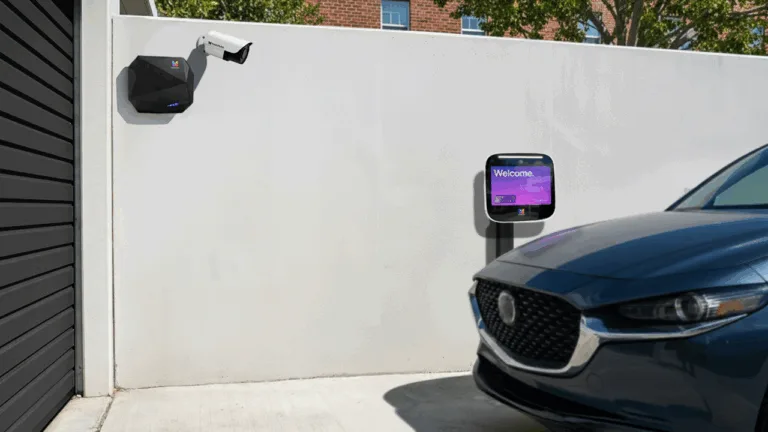
Hands-free vehicle access for your gates, garages, and other property entry points.
Key locker
An automated key locker system that allows prospective residents to access locked amenity spaces and apartment units during self-guided tours.
Audience
Developers
Concerned with cost savings to maximize profits when they sell to owners.
- Eliminate costs (focus on wires, reduced installation costs, no in-unit hardware).
- Architect: can design ButterflyMX into plans. They are concerned with aesthetics + no wiring.
Owners
Concerned with occupancy level to keep their loan rate stable.
- Want to command high rent levels with shiny amenities.
Property managers
Concerned with resident satisfaction and retention.
- Operational efficiency is important.
- They want renters to be safe and happy.
Residents
Demand convenient, secure tech and an enjoyable lifestyle.
Installers
Concerned with installation convenience, clarity, and cost.
- They have new financial incentives to sell and install our products.
Design principles
Reliable friend
Consistent, validating, gives feedback.
- As a user, I should be able to find what I need, or know where to look.
- As a user, I should feel empowered to use the tools available to me.
- Our designs should provide ongoing, personable feedback and validation.
- Our designs should present patterns that are both consistent and reusable.
Efficient assistant
Enable speed and reduce frustration.
- As a user, I should feel like the tech knows me or what I want to do.
- Our designs should favor efficient and quick actions.
- Our designs should represent statuses that facilitate action.
Welcoming host
Intentional, unexpected whimsy.
- As a user, I feel like the experience should be worth my time.
- As a user, I should feel like I belong.
- Our designs should provide function, then reward with unexpected moments of delight.
01 Logo
What the logo represents
- Horizontal lines
- →
- comfort, stability, and new horizons
- Butterfly
- →
- universal aspirational symbol of transformation
- Gradient
- →
- aspirational glow
- Symmetry
- →
- balance and ease
- Curved edges
- →
- friendly and approachable
Our logo
Primary
Our preferred logo is the horizontal version.
Tagline
Primary logo with “Property access made simple” beneath it.
Stacked
Logomark above the wordmark.
Logomark
The gradient butterfly symbol on its own.
Flat
The flat versions are primarily for printing on hardware and swag.
- Use the gradient versions wherever possible, the flat versions are primarily for printing on hardware and swag.
Logo clearspace
- Minimum clearing space around wordmark and logomark = height of “B”.
- Minimum clearing space around logomark alone = height of top wing.
Logo errors
We always want to look our best! Please do not distort or misuse our logo, as it is the heart of our brand identity. The following are incorrect uses of our logo:
02 Colorstory
Color palette
Our primary and secondary color palettes are a sophisticated blend that begins with a deep shade of violet, transitions into a vibrant royal purple, and is complemented by a muted light purple. Since our logo is very bright and saturated, we aim to be very intentional about the use of color and negative space. Negative space (white space) can be used to frame or surround important elements, while color draws attention to them. This balance ensures that crucial information stands out without overwhelming the viewer.
Primary color
-
Primary purpleHEX #39008fRGB 57, 0, 143CMYK 60%, 100%, 0%, 44%
Secondary colors
-
Muted purpleHEX #e5e5feRGB 229, 229, 254CMYK 10%, 10%, 0%, 0%
-
Vibrant purpleHEX #6600ffRGB 102, 0, 255CMYK 60%, 100%, 0%, 0%
Grays
-
Text charcoalHEX #34343dRGB 52, 52, 61CMYK 15%, 15%, 0%, 76%
-
Dark grayHEX #6a6a7cRGB 106, 106, 124CMYK 15%, 15%, 0%, 51%
-
Medium grayHEX #b2b2bdRGB 178, 178, 189CMYK 6%, 6%, 0%, 26%
-
Light grayHEX #ebeaf2RGB 236, 236, 240CMYK 3%, 3%, 0%, 5%
Accent colors
-
Muted redHEX #ffe9edRGB 255, 233, 237CMYK 0%, 9%, 7%, 0%
-
Medium redHEX #ED3657RGB 237, 54, 87CMYK 0%, 77%, 63%, 7%
-
Muted greenHEX #cfefe7RGB 207, 239, 231CMYK 13%, 0%, 3%, 6%
-
Medium greenHEX #00b289RGB 0, 178, 137CMYK 100%, 0%, 23%, 30%
-
Muted blueHEX #e5e5feRGB 230, 238, 254CMYK 9%, 6%, 0%, 0%
-
Medium blueHEX #427bfaRGB 66, 123, 250CMYK 74%, 51%, 0%, 2%
-
Muted yellowHEX #fff0beRGB 255, 240, 190CMYK 0%, 6%, 25%, 0%
-
Medium yellowHEX #f6cf00RGB 246, 207, 0CMYK 0%, 16%, 100%, 4%
-
Medium purpleHEX #7167FFRGB 113, 103, 255CMYK 56%, 60%, 0%, 0%
Gradients and backgrounds
ButterflyMX employs gradients in its branding, seamlessly blending colors to evoke a sense of modernity and fluidity, enhancing the overall visual experience with a dynamic and contemporary touch.
Our standard background gradient is sometimes accompanied by a highlight purple to bring attention to an element.
This gradient is used to lift lighter-colored foreground elements from the background.
03 Typography
Typefaces
Our typography consists of two font families, Poppins and Inter.
Primary typeface: Poppins
Our use of Poppins as the primary font reflects our commitment to sleek, contemporary design. With clean lines and modern aesthetics, Poppins brings versatility and legibility, contributing to a cohesive and impactful brand presence.
Secondary typeface: Inter
Inter serves as our secondary typeface, tailored for computer screens with a focus on readability. Its tall x-height ensures clear legibility in mixed-case and lowercase text, making it suitable for body copy and non-headline communications.
Typestyles + uses
We have four typestyles, consisting of headings, subheadings, body, and button. We always use Poppins for our headings and subheadings, since it’s our primary typeface. Our body and button text both use Inter to achieve the best legibility. Using Inter applies to all supporting text as well.
Dark backgrounds
To achieve the best legibility, use white text on dark backgrounds.
Light backgrounds
To achieve the best legibility, use Primary Purple for headings and Charcoal for subheadings and body text.
| Usage | Font |
|---|---|
| Headings | Poppins Medium |
| Subheadings | Poppins SemiBold |
| Body | Inter Light |
| Button | Inter Medium |
CTA buttons
Compelling call-to-action (CTA) buttons are crucial for driving conversions, so it’s important their designs are contrasting and legible. Our CTAs are pill-shaped and use Inter Medium for text.
CTAs on dark backgrounds
For CTAs on dark backgrounds, use white as the pill-shape and Vibrant Purple as the font color.
CTAs on light backgrounds
For CTAs on light or white backgrounds, use Vibrant Purple as the pill-shape and white text.
- CTAs with icons are called visual indicator CTAs.
- CTAs that require a “physical” action (ex: download, watch, click, swipe) will use visual indicator CTAs.
- CTAs that use more abstract language (ex: learn, explore, find out) will not use visual indicator CTAs.
Typographic errors
Misusing typography can harm communication and our brand identity. Please avoid these common typographic mistakes:
NEW typefaces
04 Iconography
Iconography
Icons allow us to communicate ideas quickly and efficiently. We are making the shift from using outlined icons to filled icons for user accessibility. Depending on the amount of color in a design, we use either purple or gray icons. Gray icons are used when there is more color, while purple are used when there is less color.
Purple icon library
Larger icons
Sometimes, more expressive icons are necessary. We typically use these icons in presentations or other instances where we want more visual interest. These icons are purple with either one or two accent colors.
05 Illustrations
Product illustrations
Our product illustrations have evolved into minimal, split-toned designs with rounded edges and minimal use of gradients. These illustrations are typically found either on our website, on social media, or in presentations.
- Color in these illustrations can be used more liberally, but it is important to stick to flat colors unless it is absolutely necessary (example: our intercom home screen).
Scene illustrations
Scene illustrations should be minimal, with rounded shapes and limited use of gradients. The use of color within scene illustrations is more flexible, considering more colors may be necessary, but any additional colors should still complement our existing color palette.
Full-scene illustrations
Typically found on social media, these are standalone illustrations that depict a specific moment or location.
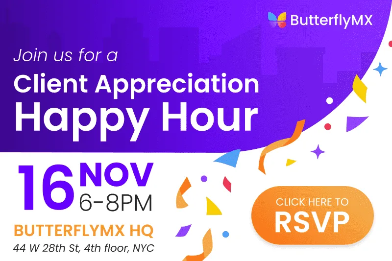
Contextual-scene illustrations
Use of subtle illustrations to help provide context and add visual interest without dominating the design (ex: city skyline to suggest the location of the event in NYC and confetti to indicate the celebration).
05 Photography
Product scene imagery
Our product imagery has a very distinct style, with highlighted products at full opacity and secondary products at a lower opacity (typically between 30% and 40%, depending on readability). Products are layered on top of a dark gradient background.
Lifestyle scene imagery
Lifestyle imagery should have a more muted, limited color palette. This is important as it helps our products pop, and doesn’t battle for attention with its surroundings. When color is used in these images, it should be consistent with our existing color palette.
06 Graphic elements
Graphic shapes
Incorporating our distinctive butterfly wing from our logo into our design language serves as a powerful visual anchor. We are phasing out the organic blob shapes and instead being more intentional with using our butterfly wing. In cases where the wing-shape is unrecognizable, it is better to use a simple circle or pill-shape to avoid visual clutter.
- Use our butterfly wing to separate elements on a page or add subtle movement to backgrounds.
Shapes in use
Using shapes helps us separate certain elements from one another, add subtle movement to backgrounds, and act as a container for content or images.
- Upper & lower ButterflyMX wing
- Visually link our graphics back to our logo and brand identity.
- Rounded rectangle
- Softens hard edges.
- Circles
- Visually links to profile photos.
- Pill-shape
- Emblematic of our swipe-to-open feature.
QA checklist
Text
- Run spell-check and review punctuation.
- View it on a mobile device — is it easy to see?
- Eliminate orphans and check for balanced text.
- Does it use text hierarchy to organize and call attention to the most important parts?
- Are font size and style consistent throughout the document?
- Are font color and size easy to read?
- Color contrast analyzer tool | Adobe Color
Layout
- Is padding around elements consistent?
- How does it look on a mobile screen?
- Does the design fulfill the purpose of the project? (get clicks, inform, educate, etc.)
- Are there any decorative elements that distract from the most important images and text?
Imagery
- Does the imagery look joyful, well-lit, and appealing?
- Are there wing shapes + rounded corners?
- Does imagery incorporate brand colors?
- Is the image resolution clear and appropriate for the setting (high-resolution images for printing, compressed images for web).
- < 50KB for 800px width blog images.
- < 200KB for 2000px full-width images.
- TinyPNG Image Compression Tool
- Are file names descriptive and SEO-friendly? (no spaces, lowercase letters: student_housing_property_access.jpg).
- Think twice before adding text to an image. Use large, simple, short labels and view on a mobile device to check the size.
Assets
- Photo library ButterflyMX photo library (opens in a new tab)
- Icon library ButterflyMX icon library (opens in a new tab)
- Color library ButterflyMX color library (opens in a new tab)
- Content style guide ButterflyMX content style guide (opens in a new tab)
- Partners Partners — logos and images (opens in a new tab)
- Slide deck template Internal slide deck template (opens in a new tab)
- Font downloads Download Poppins (opens in a new tab)Download Inter (opens in a new tab)
- Image compression tool TinyPNG (opens in a new tab)
- Color contrast tool Adobe Color (opens in a new tab)
Connect with us
Browse our website and follow our social media profiles to see our brand in action.
Questions?
Reach out to marketing@butterflymx.com for additional information or specific image requests.
-
Websitebutterflymx.com
-
Call(800) 398-4416, ext. 1
Mon – Fri. 9–6 ET -
-
Visit44 West 28th Street, 4th floor
New York, NY 10001 - LinkedIn@butterflymx
- Facebook@butterflymxintercom
- Instagram@butterflymx_
- X@_butterflymx