As symbols of transformation, butterflies attract, inspire, and elevate all who are fortunate enough to cross paths with one.
Since 2015, when we first introduced the smart video intercom to the world, ButterflyMX has been synonymous with property technology. Our video intercom immediately adds convenience and security to any type of multifamily, commercial, student housing, or gated property. And today, our intercom is installed in more than 6,500 buildings serving more than 650,000 apartments, including those developed, owned, and managed by the most trusted names in real estate.
But ButterflyMX has grown into more than just an intercom. So to match our growing brand, we’re proud to unveil a new logo. One that supports our evolving suite of simple yet powerful products and integrations, which are all designed to create a complete property access experience — seamlessly unlocking doors and gates into and throughout an entire building. Read on to learn more about our design process and why we believe now is the right time for a new set of wings!
This post covers:
Why evolve the ButterflyMX logo?
In early 2021, the ButterflyMX design team tackled the exciting challenge of rethinking and solidifying our brand identity. We were eager to make our logo a delightful extension of our core values and the experiences we deliver. So, we brought our employees, partners, and customers together to work on a shared vision for ButterflyMX.
To benefit our evolving company, products, and customers, we wanted to create a new brand identity that is:
Consistent and applicable
One challenge with our old logo was the complexity of its design. The original logo was composed of over nine colors, making it difficult to reproduce on our devices and materials. This led to sub-optimal results when trying to replicate the exact colors through screen printing or other methods. That’s why we designed the new logo with clean, simple colors and shapes.
Memorable and replicable
We set out to produce a recognizable logo that could be easily identified because of its iconic simplicity. Many companies — like Nike, McDonald’s, and Apple — achieve this in their logos, and we were driven to do the same. As our products improve in design and scale, our logo should be easily recognizable from anywhere to anyone, inviting curiosity and exploration to our brand.
Refreshed and sophisticated
ButterflyMX has significantly evolved and matured since our conception, and we wanted to portray these qualities in the new logo. We’re growing and constantly building new products that unlock new experiences. And we want our brand perception to reflect this growth. So, we felt the new logo should elevate our brand and image.
The rebranding process
Over several months, teams across ButterflyMX collaborated on this rebranding project. The journey involved distilling many brand conceptualizations, shape explorations, and color palette selections into a final, simple brand identity that is as friendly as it is elegant.
Our redesigning process included:
Defining values
To guide the design process, we first wanted to unify our collective team efforts with defined key values. Through conversations with our users, teams, and partners, we distilled the essence of our brand down to a list of sentiments that summarize its most treasured aspects. We defined values that encompass the perception of our hardware and software experiences.
ButterflyMX’s key values:
- Open
- Friendly
- Simple
- Joyful
- Aspirational
- Modern
- Welcoming
- Inclusive
- Freedom
- Seamless
- Secure
With these principles as our guide, we redesigned our logo to make every brand interaction feel welcoming, simple, and secure for our diverse customer base.

Research and outlining best practices
For research, we analyzed industry trends to evaluate elements that could work with our brand as well as ones to avoid. From there, we began simplifying shapes and balancing color and weight to make our logo iconic and recognizable.
We eliminated shapes and textures that felt sharp or cold. Instead, we favored rounded edges and curves that spoke to our key values. We also redefined the brand’s color palette. In the end, all this helped us bring our ideation to life.
Ideation
Our ideation phase started broadly with the team creating over 25 new concepts and forms, while also exploring adjustments to the existing logo. We dedicated a month to holding discussion sessions where the team presented ideas and gathered cross-department feedback. After each session, the team incorporated suggestions and edits into the new logo design. We finally settled on two polished logo variations and two color palettes. Then, we shared these results with the entire company for a final round of feedback.
Feedback
During the final discussion sessions, we introduced the two logo variations separately, showing them on black and white backgrounds. We provided color palette variations and example logo placements on our products and materials. The feedback was overwhelmingly positive. But despite agreement on the general design direction and even a preference for certain colors, we still didn’t have a clear winner.
To make an informed final decision, we objectively selected 20 people in our organization — evenly distributed and varied across departments — to participate in a brief survey about the two logo variations. Survey results came back in favor of the logo that better resembled the shape of a butterfly.
Final outcomes
For the final step, we entered the refinement process to ensure that the selected logo design was polished and that its colors and gradients were dialed in. Lastly, we addressed any remaining concerns before launching and sharing the final product across the company.
![]()
While exploring shapes across our initial concepts, we kept returning to symmetrical and balanced shapes that authentically resembled a butterfly — harmonious and organic.
Then, we solidified the following elements of the final masterpiece:
Form
Our new logo encompasses the spirit of our previous logo while elegantly simplifying its form and colors into a memorable, recognizable shape. The new logo reflects the attributes of a butterfly — simple, iconic, and easy to identify.
Some notable features include:
- Symmetry generates comfort and security.
- Rounded edges and organic shapes make the design friendly and approachable.
- A low horizon line represents possibility and new horizons, adding sturdiness and stability to an otherwise fluttery form.
- The four wings represent the four types of customers who purchase and use our products: property owners, managers, residents, and visitors.
- Four distinct wings are brought together in a unified image that represents inclusivity and collaboration.
- Open wings in flight and the spaces between each wing symbolize openness, opportunity, and freedom.
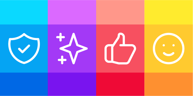
Color
The new logo stays true to the original, cheerful, multicolored palette, which included sophisticated shades of primary colors. These transitional tones feel fresh and modern, yet still retain the joy, friendliness, and optimism of our previous multicolored logo.
The subtle gradients in the logo reflect elements in nature, generating serenity and creating aspirational glow and expansiveness. This is an intentional choice to appeal to the real, human users of our product. Our brand has always prioritized creating joyful experiences that appeal to users on an emotional level rather than an exclusively technical level. Our logo emulates these sentiments with gradient colors that embody both depth and lightness. The lightness in the center of the logo emphasizes the open, portal-like quality that has always been at the core of ButterflyMX.
The movement of cool to warm colors leads the eye forward from left to right to represent movement into and throughout a property.
- ButterflyMX Blue represents trust, clarity, and expansiveness.
- Property Purple is welcoming, modern, and aspirational.
- Convenient Coral reflects strength, warmth, inclusivity, and security.
- Joyful Yellow embodies joy, friendliness, and optimism.
Typography
The clean spacing and decisive edges of our typography demonstrate trust. Additionally, its roundness and width express friendliness and approachability. We wanted a simple, distinct font with enough presence to distinguish our branded materials from those of our competitors and complement our logomark.
Conclusion
As a symbol of transformation, the butterfly embodies the important values, name, and origin of our company.
In the words of ButterflyMX’s founder Cyrus Claffey, “We transformed the intercom industry by creating the world’s first smart video intercom that could send video fluttering from the front door through the ether like colorful wings to any person no matter where in the world they are.” And as we continue to evolve and adapt our brand, products, and vision to the ever-changing needs of the real estate industry, we invite you to join us on this journey and evolve with us.
